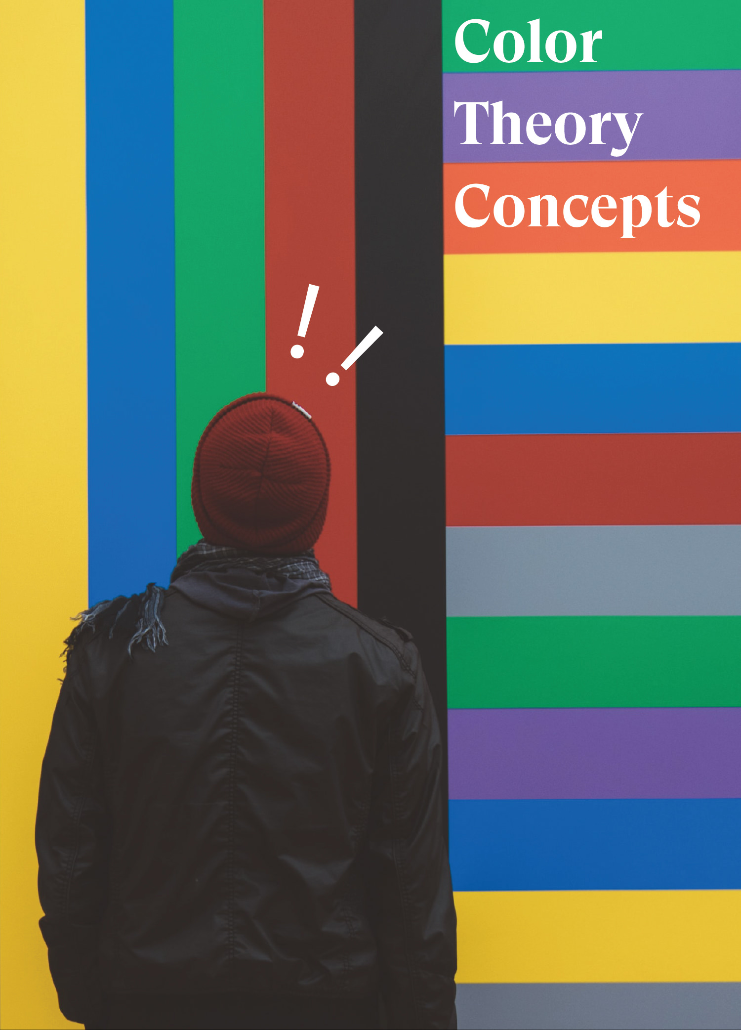
“Having a deep understanding of the color theory is vital to craft outstanding, eye-pleasing artworks.”
Let’s assume you missed science class about light, and let’s start from the very beginning: Our eyes and brains perceive and translate light into colors. Our light receptors deliver messages to our brains, which -finally- produces the familiar perceptions and sensations of colors.
The surface of any object reflects certain colors and absorbs the rest. Yes, you guessed it. We sense the reflected ones only. So colors aren’t inherent in objects as sir Newton observed.
Now put science aside and back to design, when people search for certain products or brands, they subconsciously look for colors not logos or names. In fact, their final purchase decision is highly built on the colors only. That’s why entrepreneurs and business developers pay extra attention to color selections for their visual identities.
Due to its great influence on design mood & meaning, Colors comes on the top of the most powerful elements of any composition. When selected conveniently, both designers and marketers can guarantee the deep message is being successfully delivered.
In the visual arts, the conceptual science of using colors is called the color theory. it’s the approach expert designers follow to decide colors for their pieces. Color theory demonstrates how colors interact & mix together, communicate core values and how viewers perceive them eventually. Having a deep understanding of the color theory is vital to craft outstanding, eye-pleasing artworks:
Although there are countless color theory concepts and definitions, experts agreed to set them into three basic categories anyone can make use of:
- The color wheel
- Color harmony
- The context.
1) The color wheel:
Colors are organized in a color wheel in 3 main definitions (or categories) :
- Primary colors.
- Secondary colors.
- Tertiary colors.
Primary Colors:
- Red, green and blue

the main pigment colors that can’t be produced by any color combination. every color else is created out from these 3 colors.
Secondary colors:
- Orange, green and purple.

Colors created by the mixture of the primary colors.
Tertiary Colors:

- Yellow-orange, red-orange, red-purple, blue-purple, blue-green & yellow-green
colors created by the mixture of a primary and a secondary color.
2- Color Harmony:
In color theory, the combinations of harmonious color (also known as Color Schemes or Color Harmonies) are created by the usage of any two colors from opposite sides on the color wheel, or three colors from equal in-between space (shaping a triangle), or four colors shaping a rectangle. They should stay in harmony no matter what the rotation angle is.
Harmony in general is the pleasing arrangement of items. Without harmony in any application, things will feel chaotic and lifeless. In design, harmony catches viewer’s attention and creates a feeling of satisfying order and visual balance, which leads to more structure and effective message-delivery.
Yes, colors are mostly personal preferences, however, not every color always work along with any randomly-selected colors. There’s science behind it to guarantee harmony and fitting of colors.
Color Harmony has basic formulas, which are:
1) analogous colors:

They are the colors which are side by side on the color wheel. they are often found in nature and pleasing to the eye.
When using analogous colors scheme, select colors with enough contrast. Pick three colors: dominant, secondary and accent.
2) complementary colors:

They are the colors that each of them is on the direct opposite side of the color wheel (e.g red and purple).
Complementary colors give maximum contrast, But should be used carefully to avoid dissonance.
3) Triad:

They are the colors which are equally spaced around the color wheel. They are known to be very vibrant, so they need to be intelligently balanced.
3) Color Context:
The relation between colors and how one color responds and behaves to another is a critical area in color theory. Our perception of colors depends on the relationship of coolness or warmth, values and saturations of the color.
When colors are used together, they interact with one another and change our perception. This process is known as simultaneous contrast. While colors never alters, the way they are used together, since we rarely use one color solely, is what affects us and helps in changing our perception and sense of the color. Simultaneous contrast is at its highest when colors are a complementary color scheme.